Remaking Search for the modern era
Leading design across a decade of transformation
Impact
- Led Search design through a decade of transformation (20x growth), from blue links to answers to a modern design system. 2B+ daily users.
- Search's UX organization grew from fewer than 20 to over 500 during my tenure. I scaled a director-level team of 20+, built visual design and content design as functions where none existed, and led organizations of 100+ designers.
- Transformed Search's answer experience from zero to a majority of 5 trillion annual queries receiving a direct answer, built on architecture I led from the Knowledge Graph
- Saw that Search had no design infrastructure, built the Design Systems organization to fix it, and changed the culture from microoptimization to tokens and shared components
Context
I led design for Google Search for over a decade, across four paradigm shifts: mobile, answers, discovery, and AI.
The people using Search have changed as much as the product. A generation arrived that grew up on TikTok and Reddit — expecting video, social proof, and direct answers, not a ranked list of links. The design task is to serve both: expand what Search can do without breaking what people already depend on.
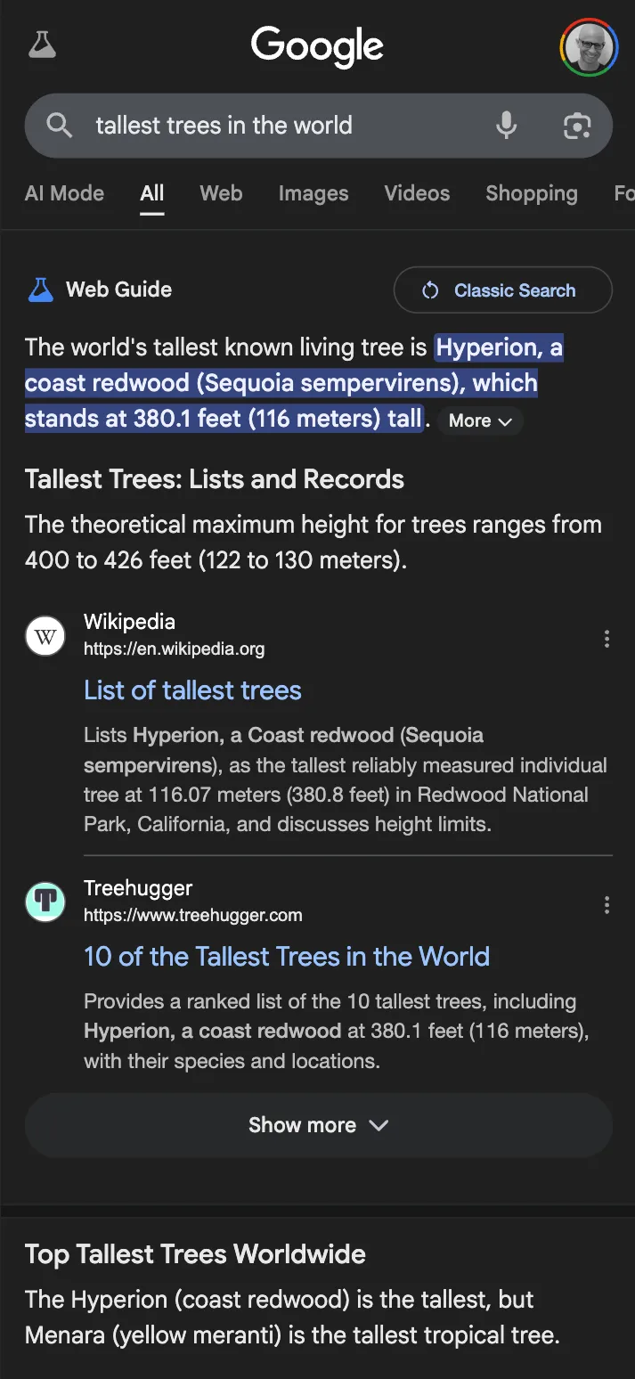
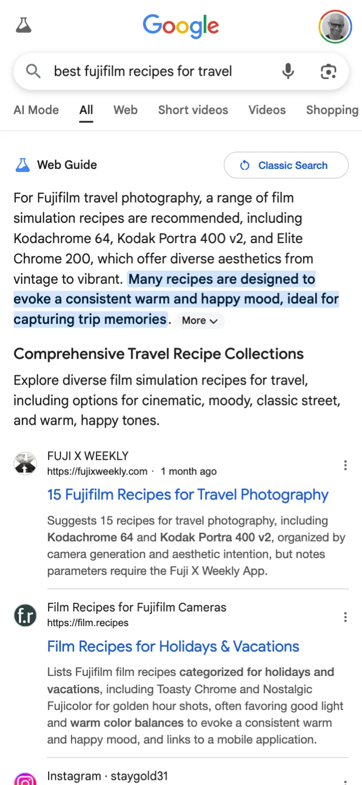
Answers
Speed and helpfulness have always been the north star metrics for Google Search.
I led design for the Knowledge Graph — launched following Google’s acquisition of Metaweb, a startup I joined early-stage. It is the foundation for every answer in Search. Over the following decade I led the organization that extended it — rich entity experiences, featured snippets, AI summaries. The majority of queries (5 trillion annually) now receive a direct answer.
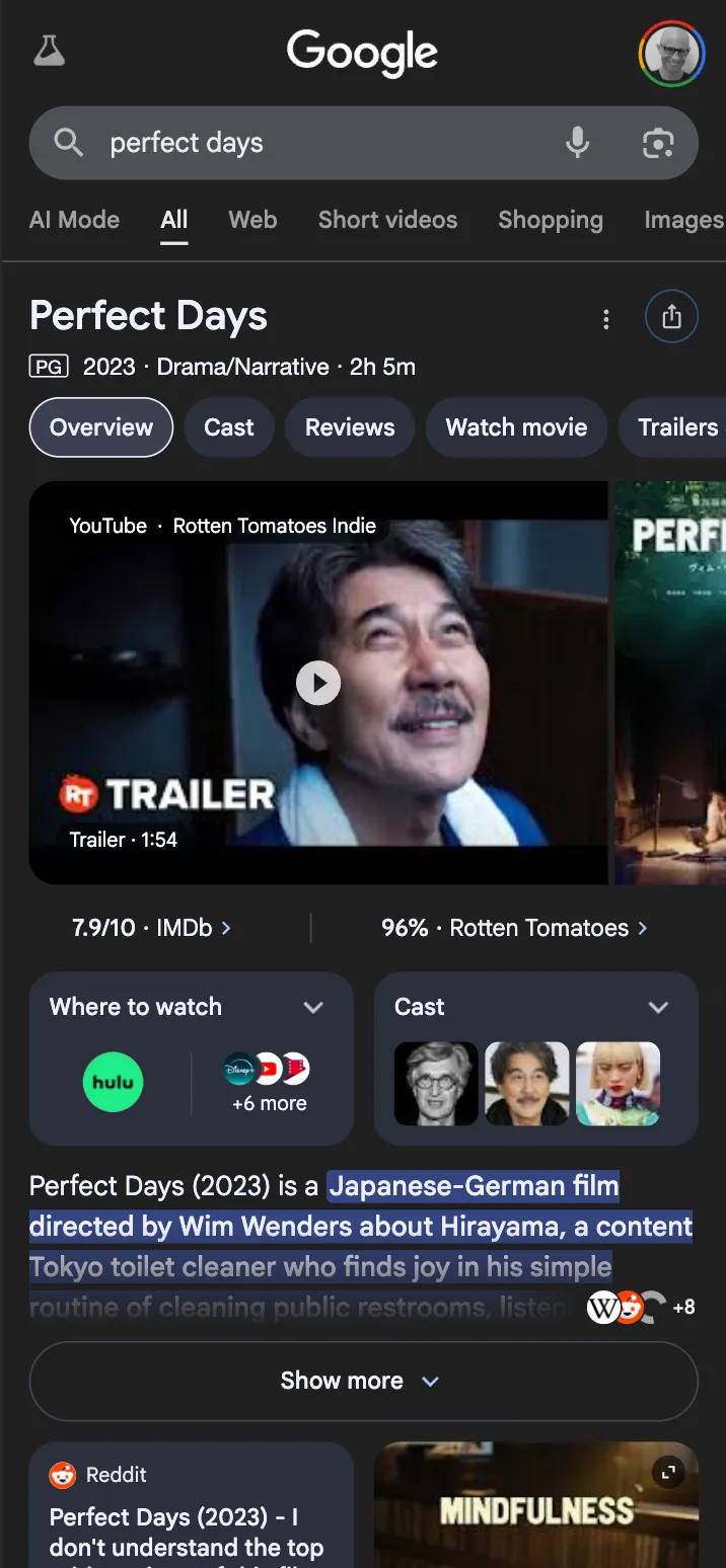
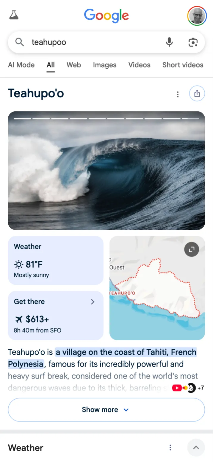
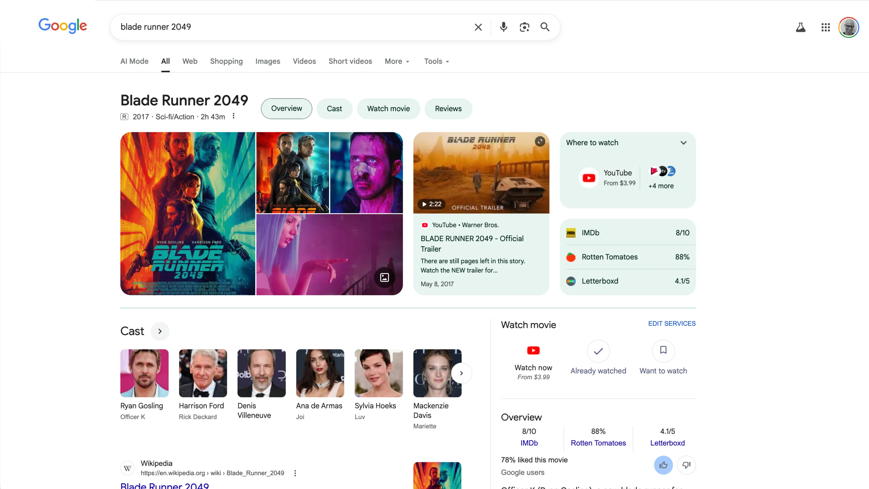
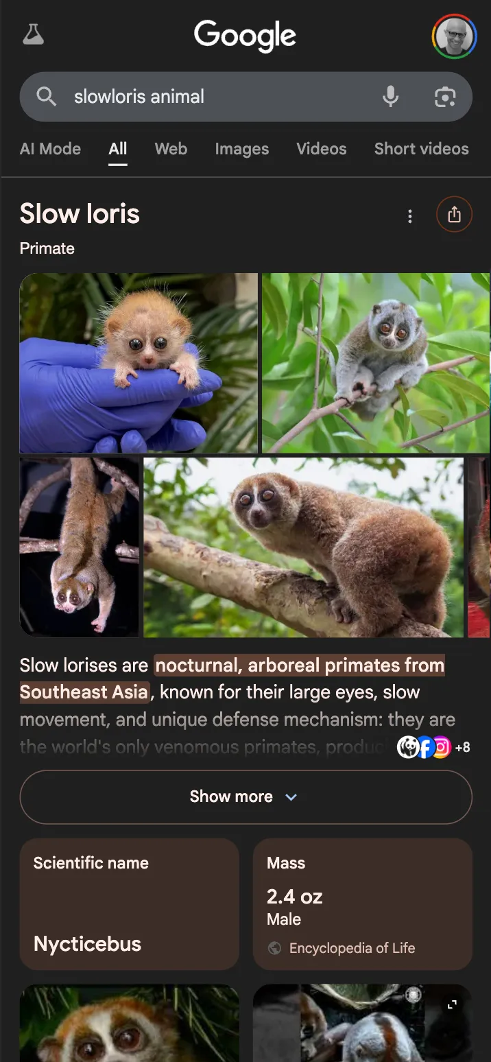
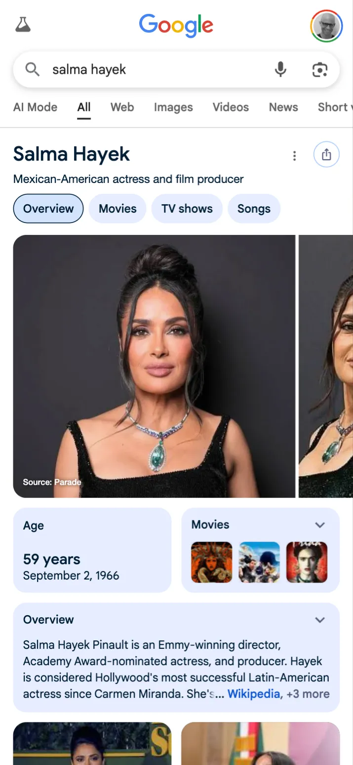
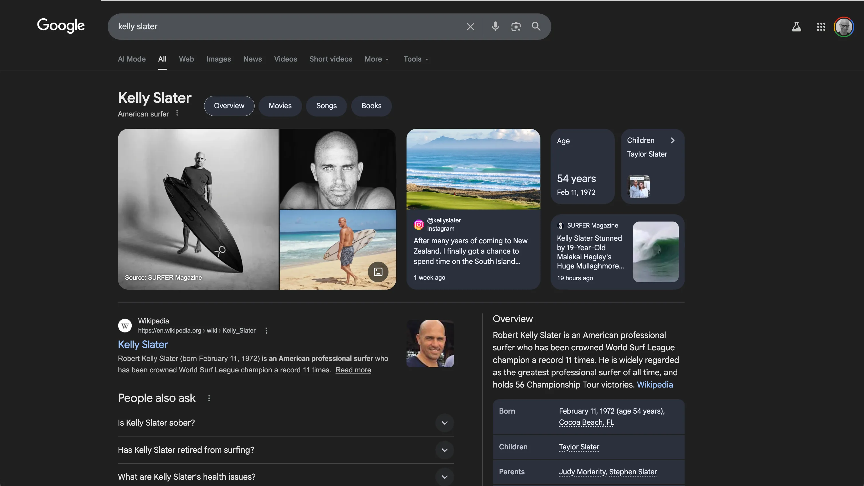
No two queries are the same, but the experience has to feel like it was designed for all of them — a single framework flexible enough to serve a simple fact like how tall Victor Wembanyama is, a popular entity like Taylor Swift, or a nuanced summary of a complex topic like photosynthesis.
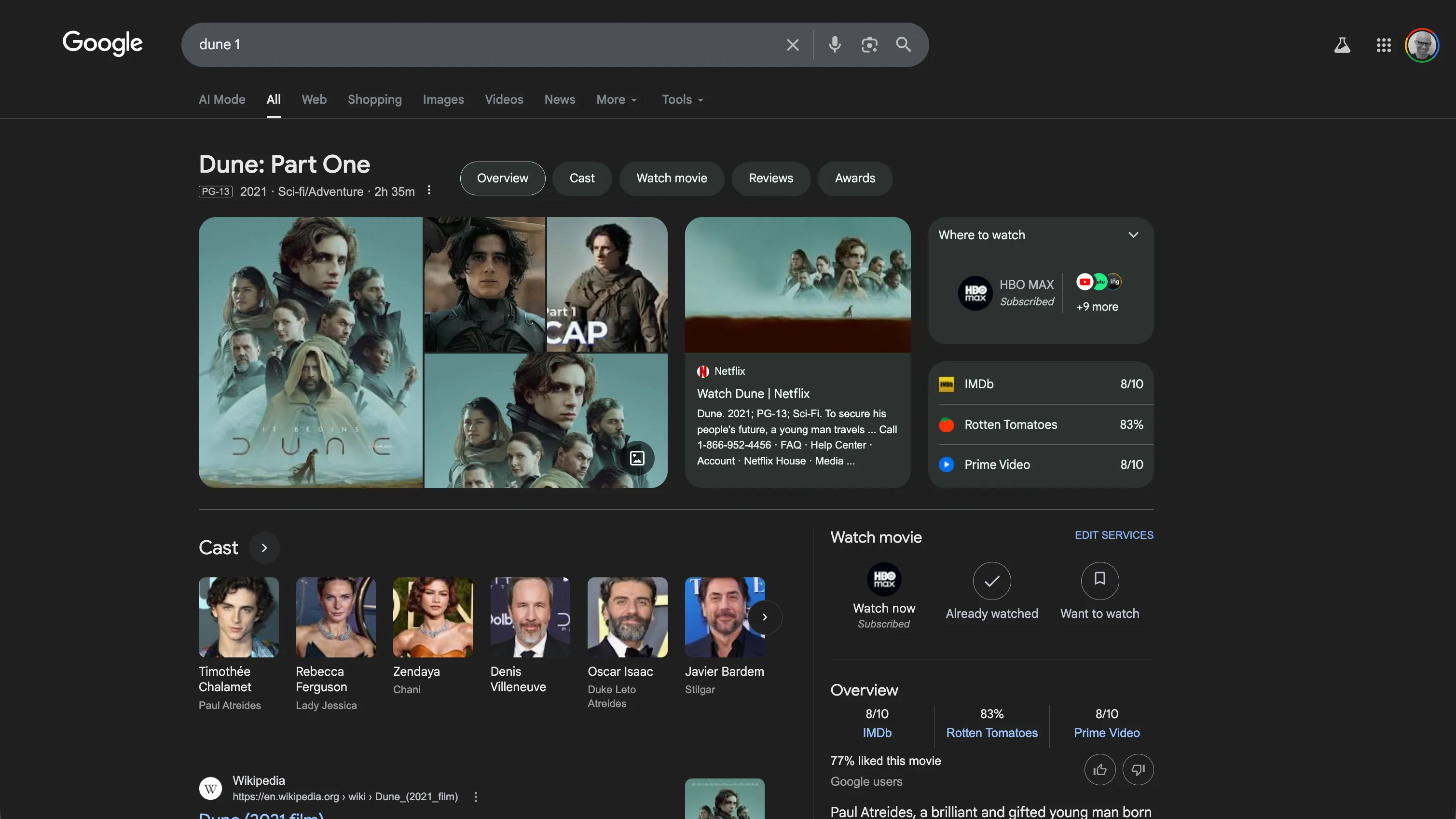
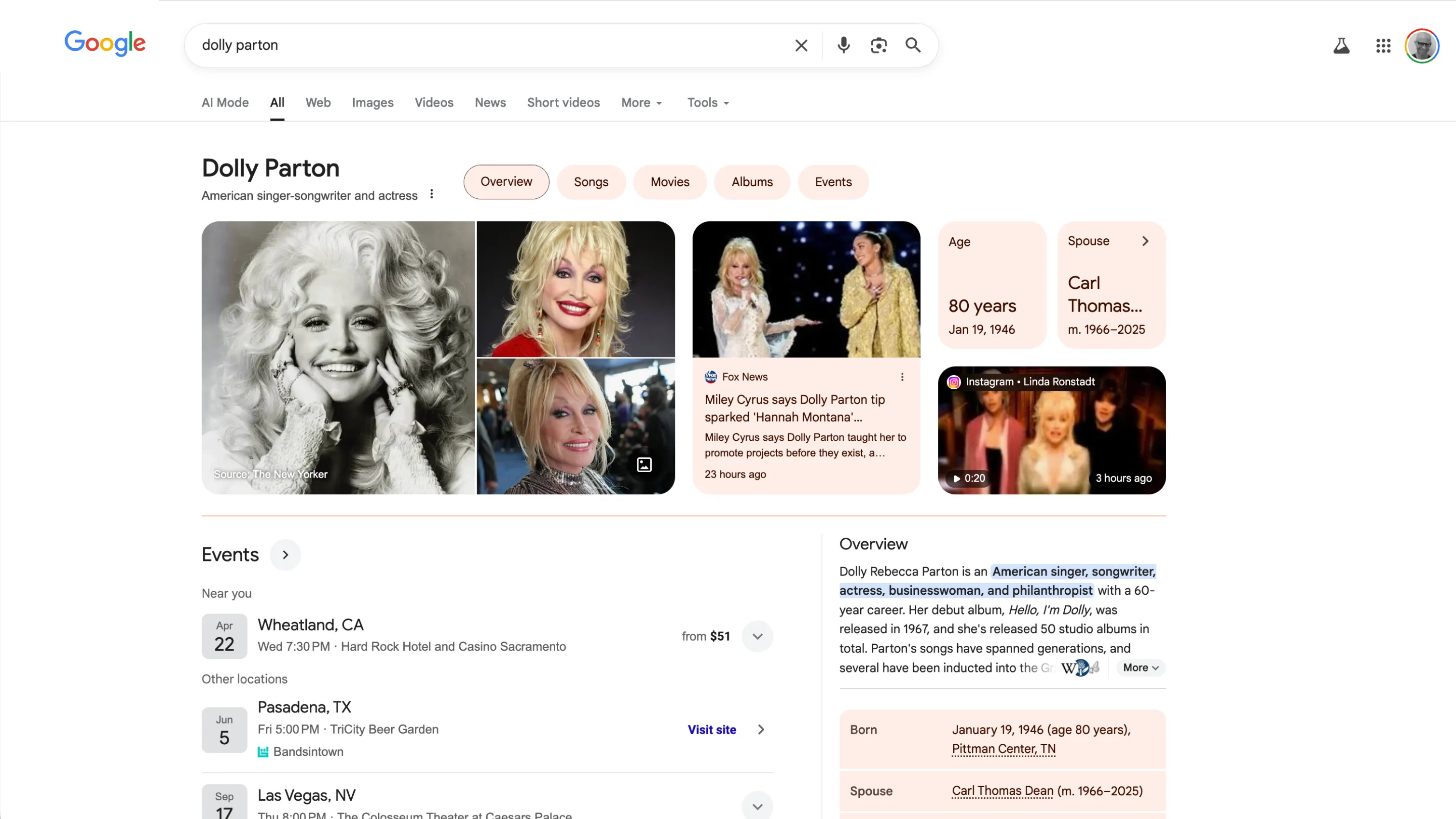
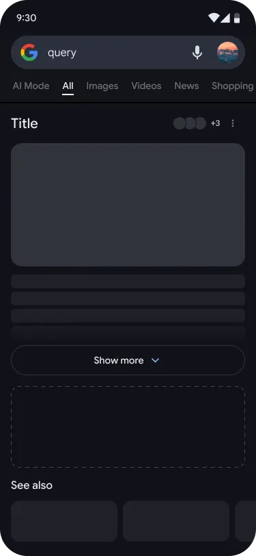
Rich Results
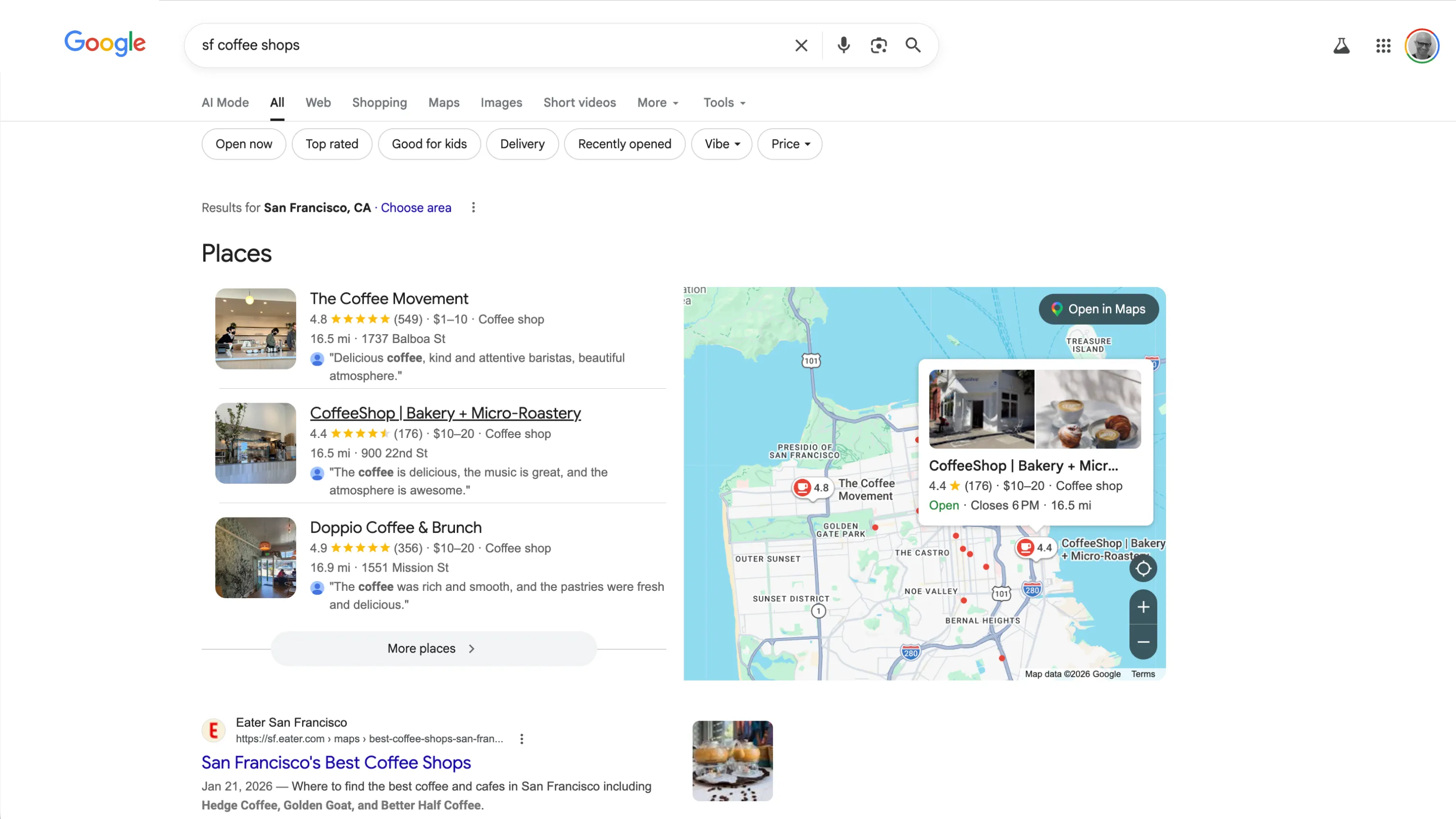
If a majority of queries in Search are answerable, the remaining are harder: subjective, exploratory, perspective-dependent.
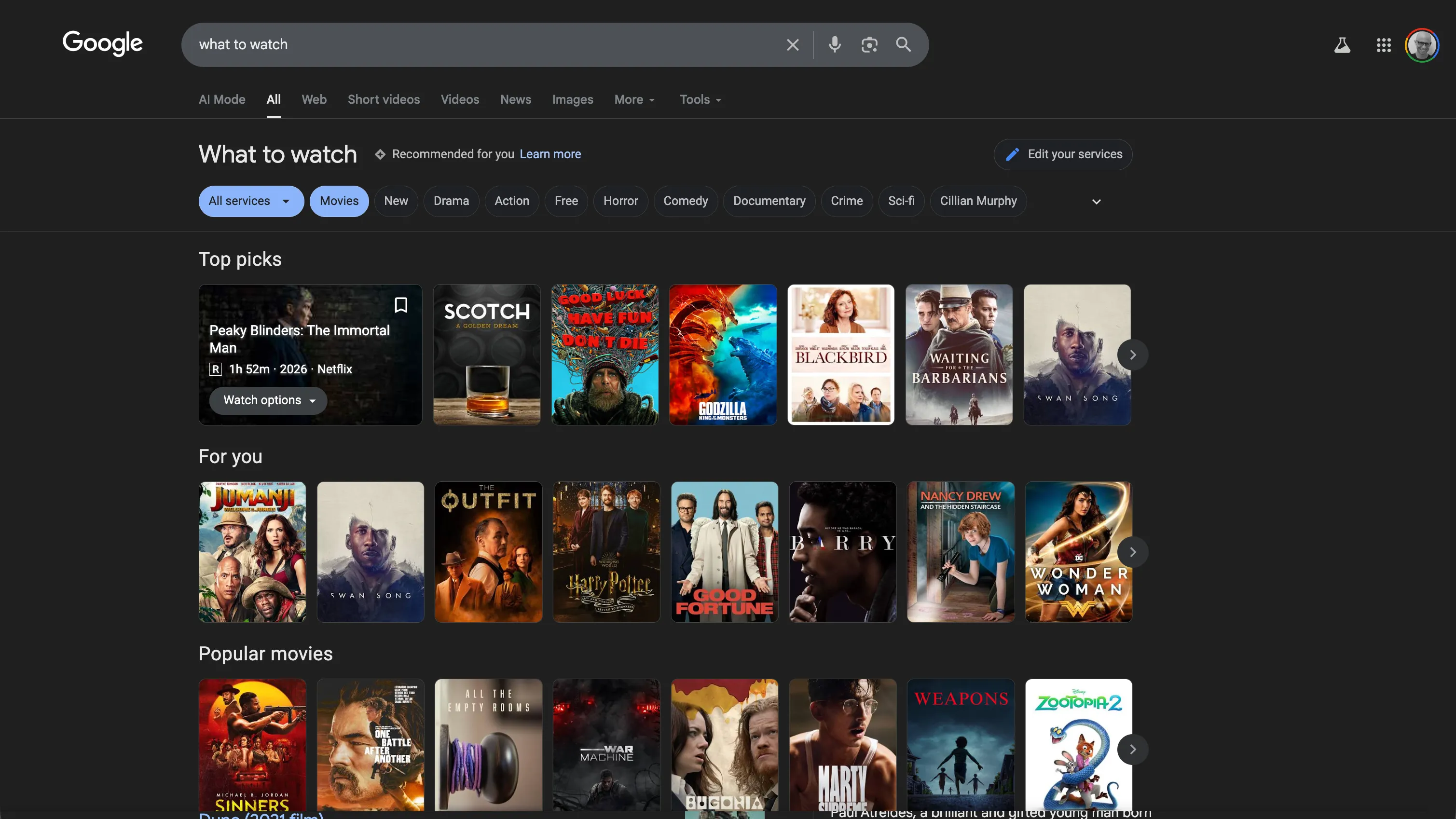
The original results page was built for one content type: the web link. Expanding to video, forums, images, and social content meant each type needed its own visual language — and none could feel secondary.
The harder challenge was the design framework itself. Balancing authoritative and authentic signals algorithmically meant the page had to render an increasingly diverse set of content types. We rebuilt it to handle all of them.
Modernizing Search’s design system
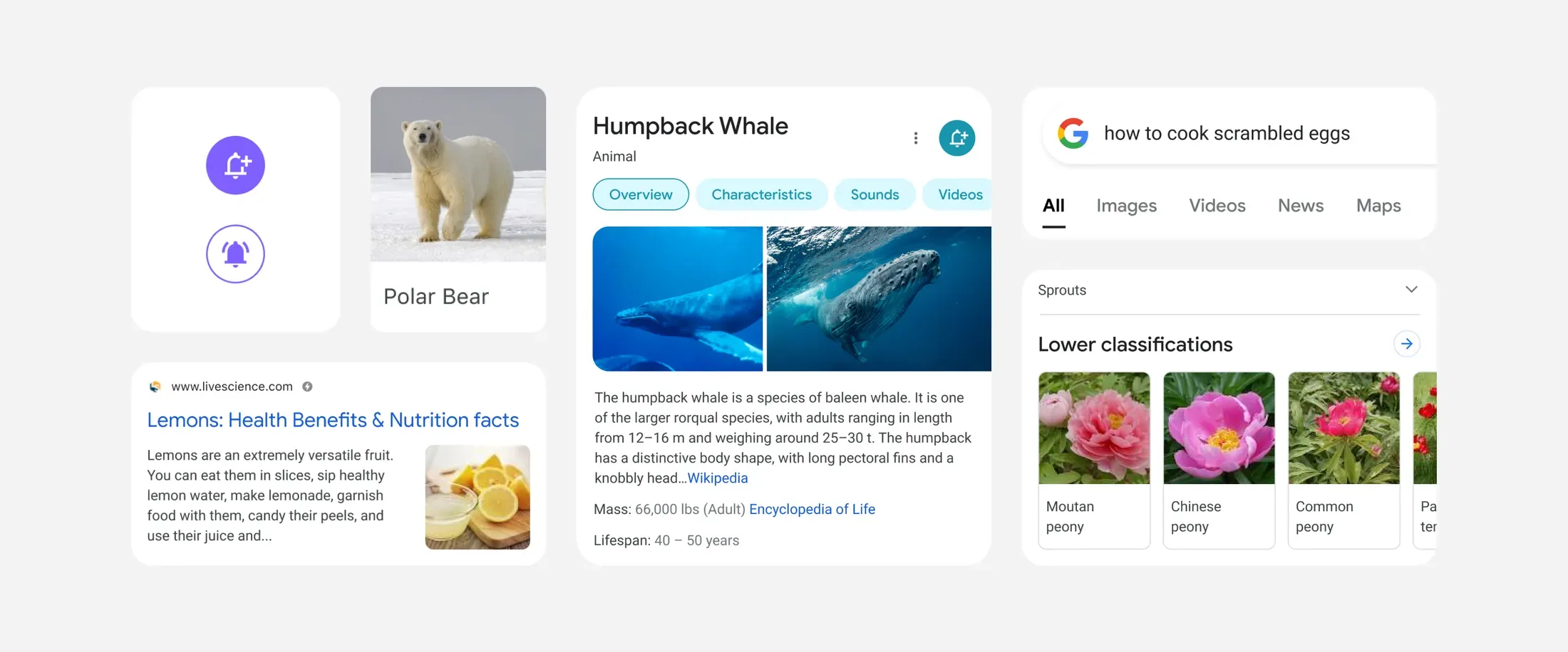
Sentiment research showed people — especially younger people — felt Search was dated.
Modernizing Search’s visual language was a multi-year evolution, not a single redesign. Material Design had real credibility in the design community, but it was built for app UI, not content display, and Search’s metric sensitivity made wholesale adoption impossible. We built a version optimized for information density that could perform within Search’s highly sensitive metric constraints. Two decades of feature development had made the product difficult to evolve at precisely the moment it needed to move fast. One developer found 250 distinct shades of grey hardcoded — six short of the theoretical maximum.
I built a new organization to fix it. We migrated thousands of hardcoded values to design tokens, consolidated legacy typography to a normalized typescale, and partnered with engineering on shared components in production. A full dark mode redesign that had previously taken several months was completed in two days. The same system became the foundation for AI Mode.